Aesthetic trends explode and proliferate quickly—some are only temporary while others manage to dominate the field and last for years to come. Needless to say, the design world moves rapidly.
And that’s the beauty of design; it’s an ever-changing field which challenges artists to constantly create and be inspired by others.
While trends can certainly be overwhelming at times, it’s crucial to monitor them in order to make smarter, more informed and creative choices.
So with that in mind, here are a few design trends that I’m inspired by!
Minimalism
This is perhaps my favorite of all the latest design trends. Minimalism is about designers expressing only the most essential and necessary elements. No excessive details and no-frills. Just simplicity—and lots of white space! (Man, I love white space!)
The minimalist trend utilizes a limited color palette; maybe about three colors tops. It creates a clean, crisp design which gives layout elements plenty of room to breathe.
 Open Composition
Similar to minimalism, the main element in open composition design is the element of space. One style of graphic design is to encase your artwork in a box or a frame, giving the layout a sense of a “finished” feeling—a closed composition. This is not so with open composition.
The key element in open composition is creating a sense of open, airy design with elements running toward the edge and seemingly beyond the page. Open composition taps into the viewer’s imagination and invites them to visualize the picture beyond.
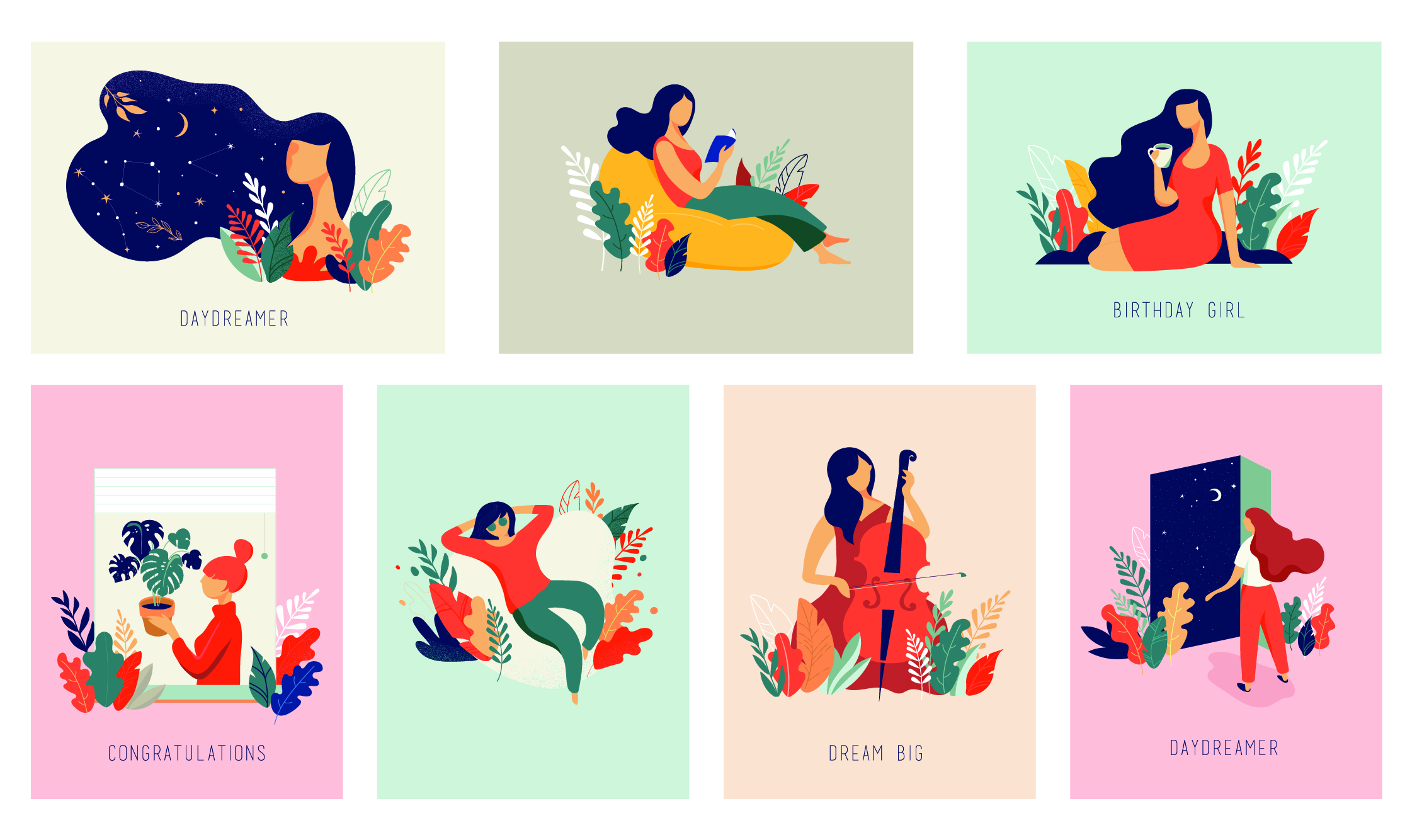
Illustrations
 Illustrations are a form of visual storytelling and are most often used to add a touch of personality to a design.
When trying to portray abstract or ambitious ideas, illustration can be a good route to take as there are no boundaries for the kind of world you can create! To top it off, illustrations are a great platform for taking people on a journey and telling a story.
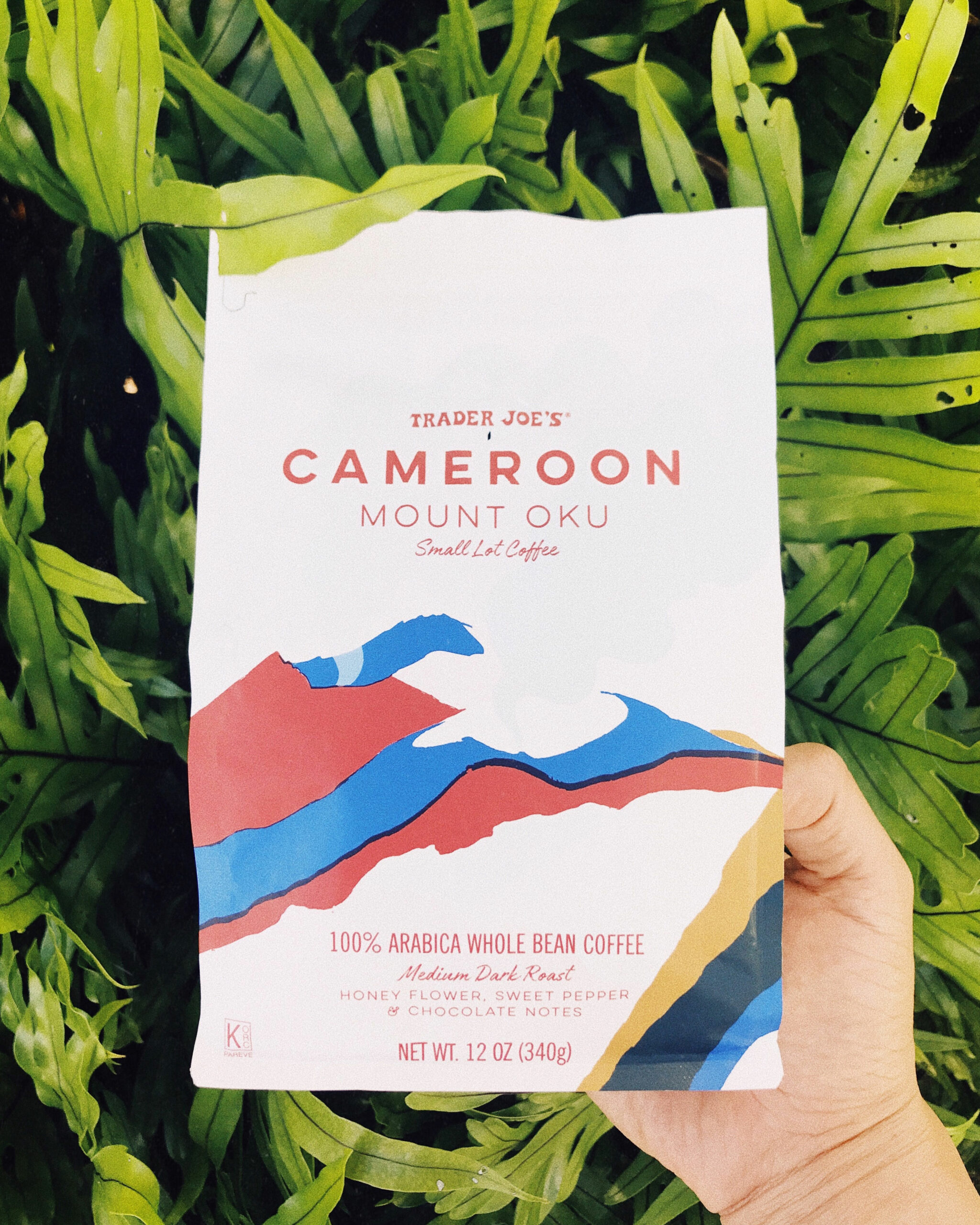
 Pops of Color
Though I’ll admit I’m a fan of neutral, muted colors, at times these palettes can make a design look gloomy or at the very least boring and dull. Sometimes all it takes to make a design pop is to add a bit of color!
By experimenting with different shades of vivid colors and placing them throughout your design, you’re sure to create attention-grabbing graphics. Though be careful to use these bright colors in moderation, as multiple shades of vibrant colors tend to overstimulate.
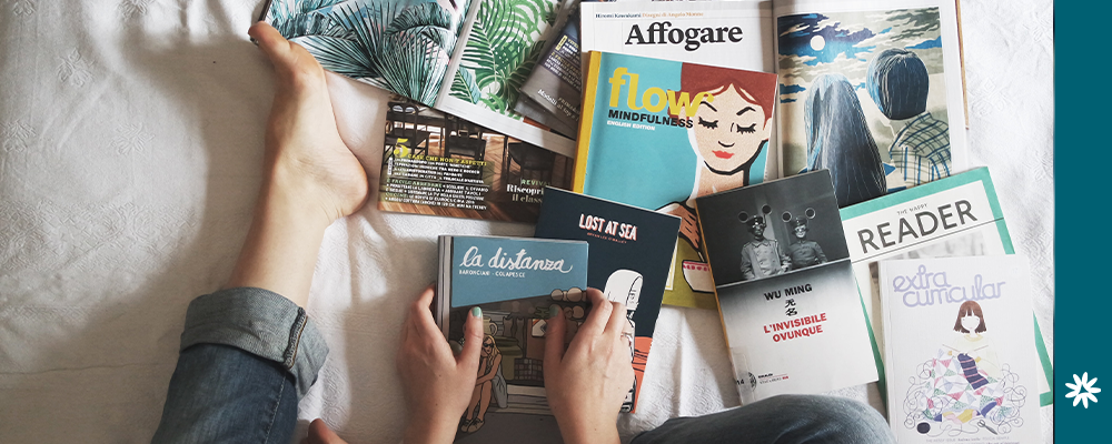
Authentic Photography
Yes, yes, yes!
As human beings, we crave authenticity—especially in art. We want something that evokes emotion in us. And I’m afraid that stiff and stagnant imagery just doesn’t cut it.
Authentic photography grabs our attention. It evokes feelings of emotion, a sense of realism and connects the viewer directly to the intended message of the design.
_____________________________
Trends represent a modern way of using tools and resources. They give us new ideas and new ways of using styles. More often than not, these styles evolve into more enduring iterations of themselves.
In a constantly changing field, it’s crucial to stay on top of trends that acknowledge great design elements. However, realize trends will come and go—but classic elements stay strong.
Great design is timeless.

